FLYWHEEL SPORTS
Flywheel App and Point of Sale
Indoor stadium cycling (like SoulCycle) app where users could reserve classes/seats, keep track of their statistics.

CLIENT
Flywheel Sports
AGENCY
Infuse
ROLE
Product Designer, UI
DATE
NOV 2015
ABOUT FLYWHEEL SPORTS
Flywheel Sports was an indoor stadium cycling company that had locations across many cities, where people exercised together on spin bikes to music and upbeat instructors. A big component of the Flywheel experience was the ability to track your statistics from your workout (calories burned, distance, ranking in class, ect).
Infuse was brought on to maintain and refresh the IOS app, as well as build a point of sale system on iPad. I was the sole designer on the project and worked with our developers to make changes.
FLYWHEEL IOS APP
Our project was to update the UI, increase legibility, and add in small features that had been requested via app store reviews (like seeing playlists from classes). Across the app, I made text styles more consistent, increased contrast between elements, and recreated all assets in sketch to make future iterations easier (for both designers and developers).
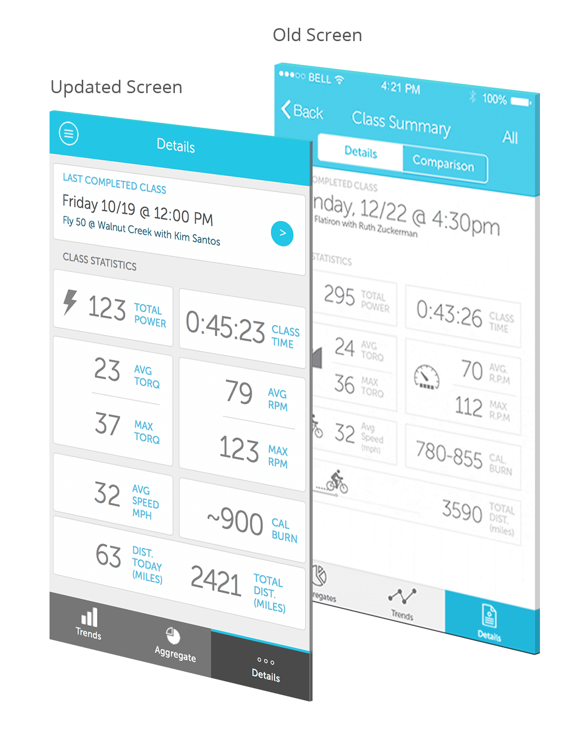
EASIER TO READ AT A GLANCE
To increase readability and hierarchy on the metrics screen, I added contrast by putting a background color behind the cards, set the labels as a different color and weight, and increased text sizing.
**(In this design mock, I forgot to put in the icons because we were using the same ones from the old design, and the developer already had them).
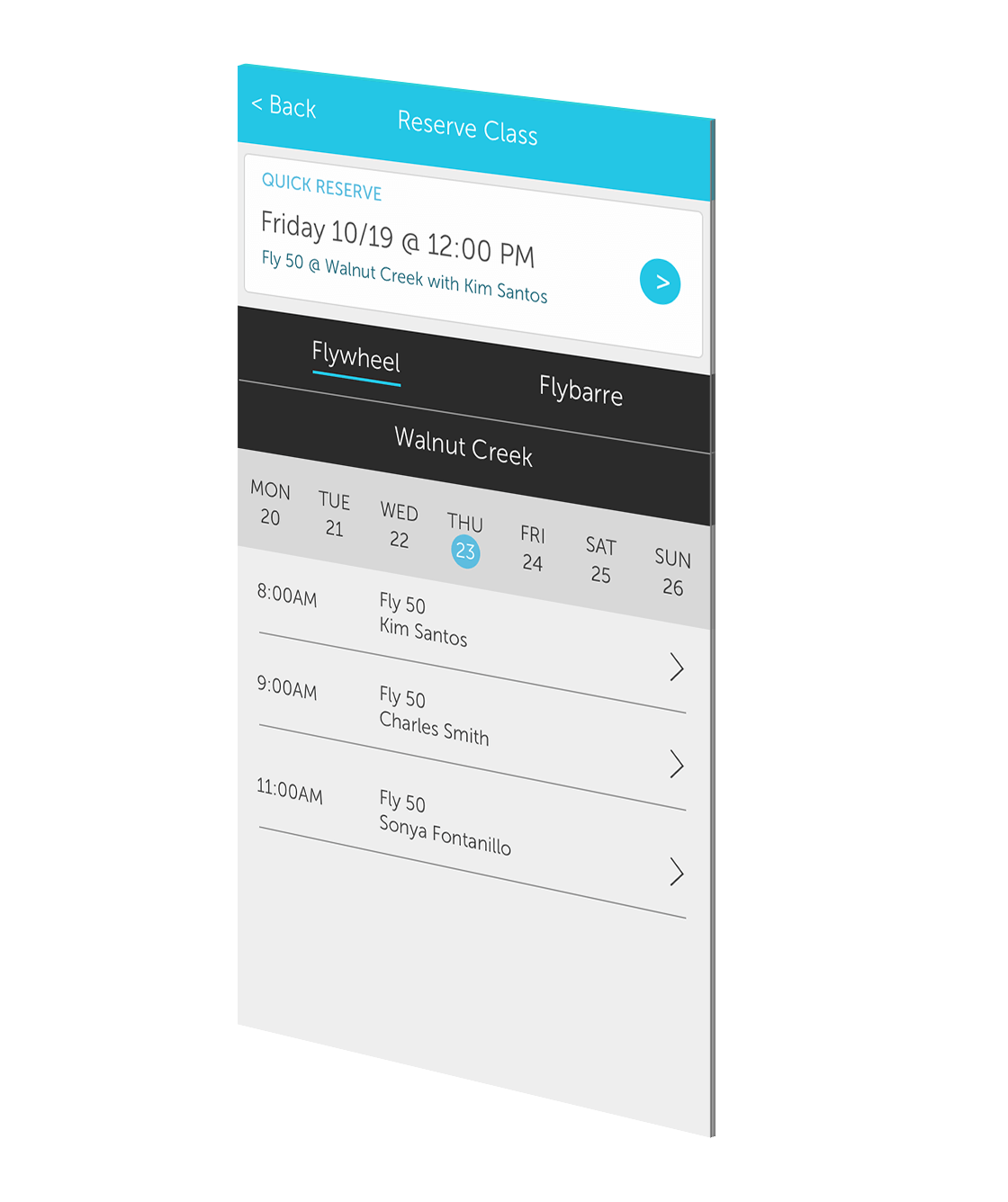
UPDATED CLASS RESERVATION FLOW
To accomodate Flywheel's additional class series "Flybarre", and to prevent class schedules from getting too long (sometimes there would be 6+ classes per day, per location), I seperated Flywheel classes and Flybarre classes with tabs.
Most customers would be fairly regular with what class time and location they reserved, so we created a shortcut for people to reserve their most commonly attended class, or their last class if they were a newer customer.
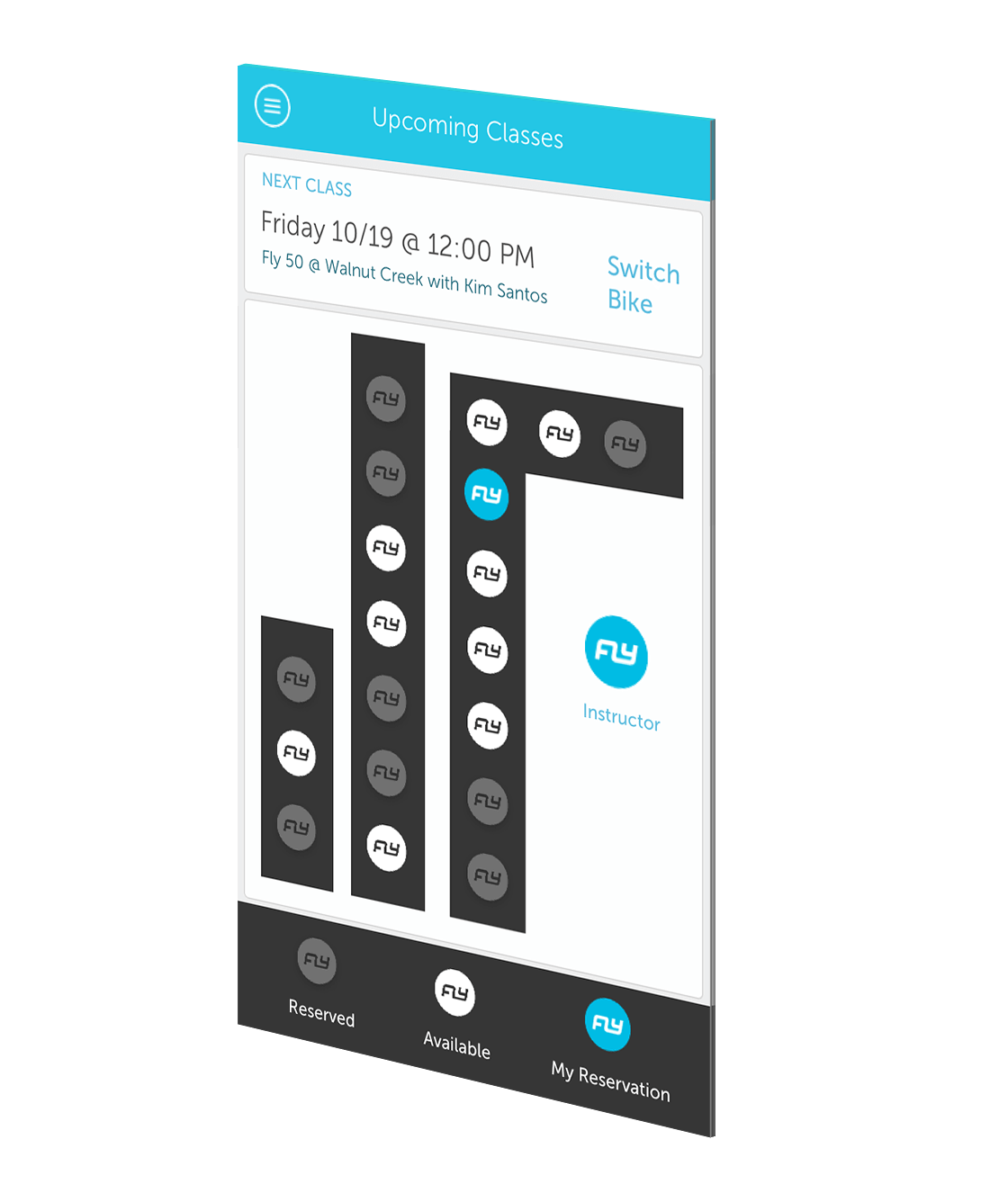
MODULAR SEAT SELECTION SCREEN
Many of the Flywheel had different classroom and seat layouts, I created a system that made visualizing where the seat was in relation to the instructor easier to understand, and in a easy to integrate format that could be used across studios and layouts. I updated colors and icons to be more clear as to which seats were still available.
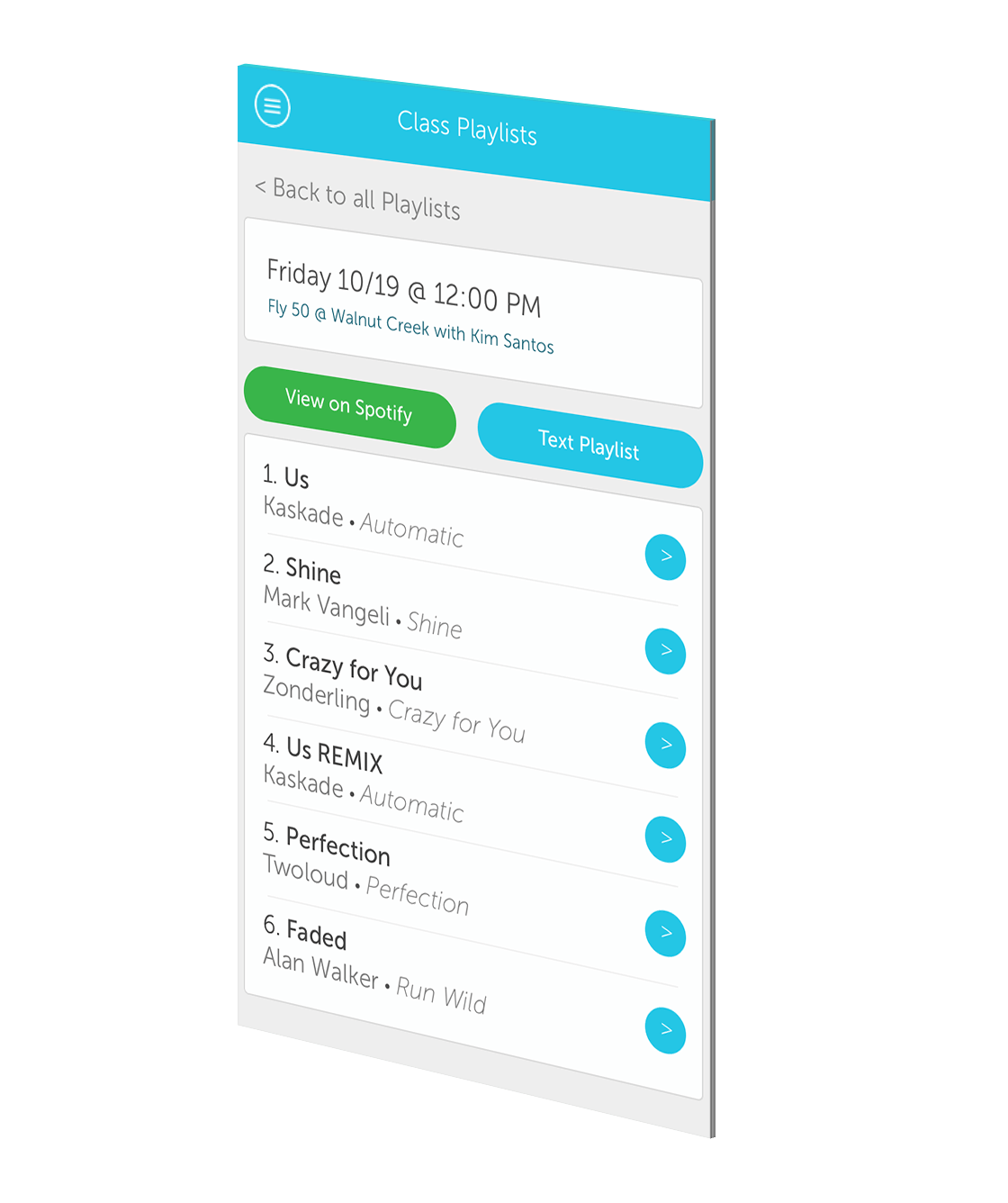
CLASS PLAYLISTS
One commonly requested feature for the app was access to playlists that instructors would put together for the class. I designed a simple list that linked to the spotify playlists, as well as an option to get the playlist texted to the user.
FLYWHEEL POINT OF SALE IPAD APP
After the UI refresh, Flywheel wanted our team to design what a branded point of sale app would look like. The client wanted the app to feel very similar to the IOS app, and for it to be able to do simple tasks like sell individual classes, class packs, and merchandise, but also be able to take credit card, cash, or gift card.
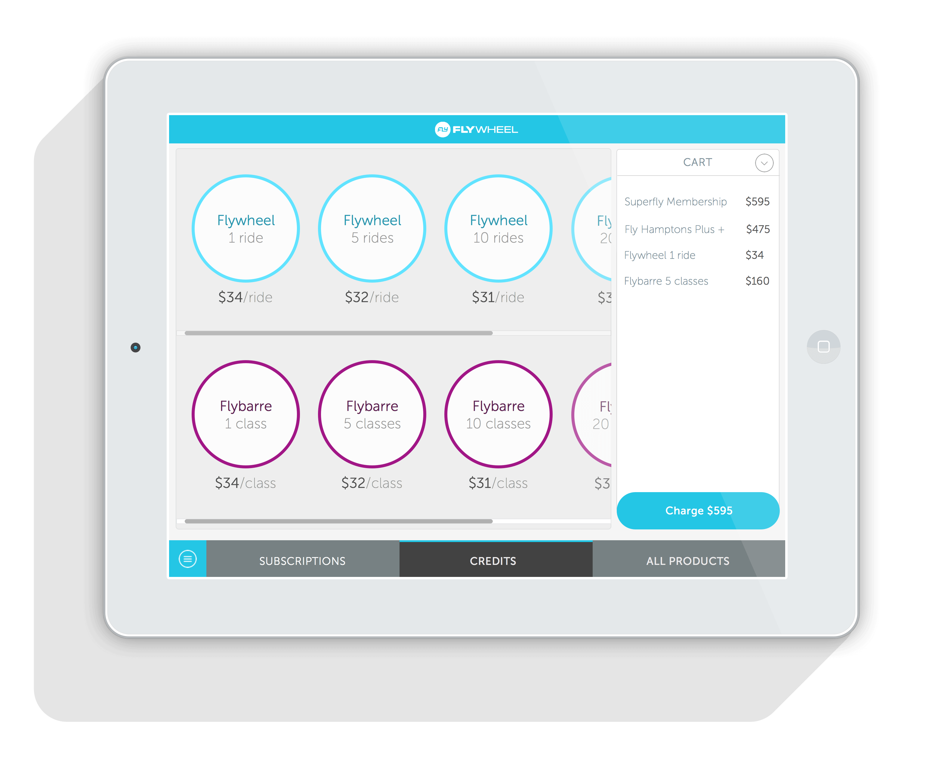
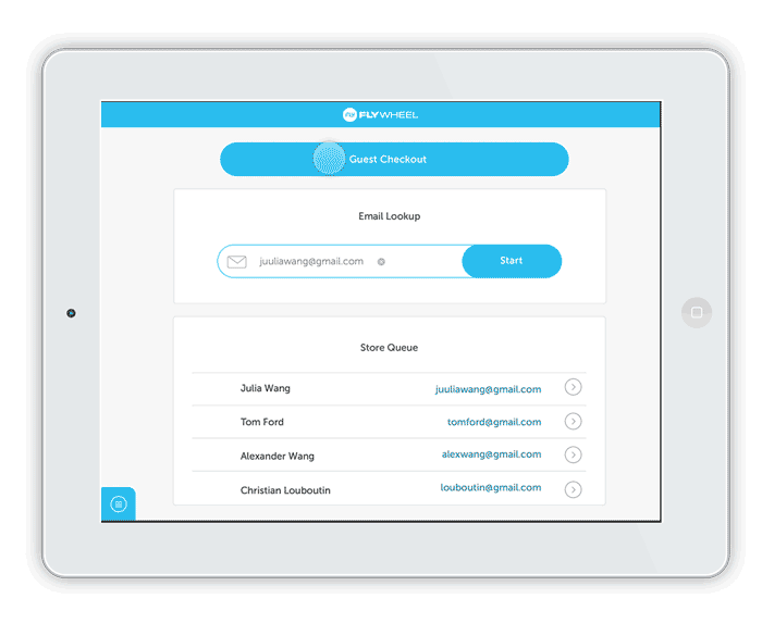
CHECKOUT FLOWS
I designed a simple checkout flow- where subscriptions, credits, and other merchandise could be processed for payment.
myRoundUp
myRoundUp App
An app designed to raise money for nonprofits by "rounding up" credit/debit card transactions
AGENCY
Infuse
PROJECT TYPE
Web/IOS App
ROLE
Designer
DATE
2015
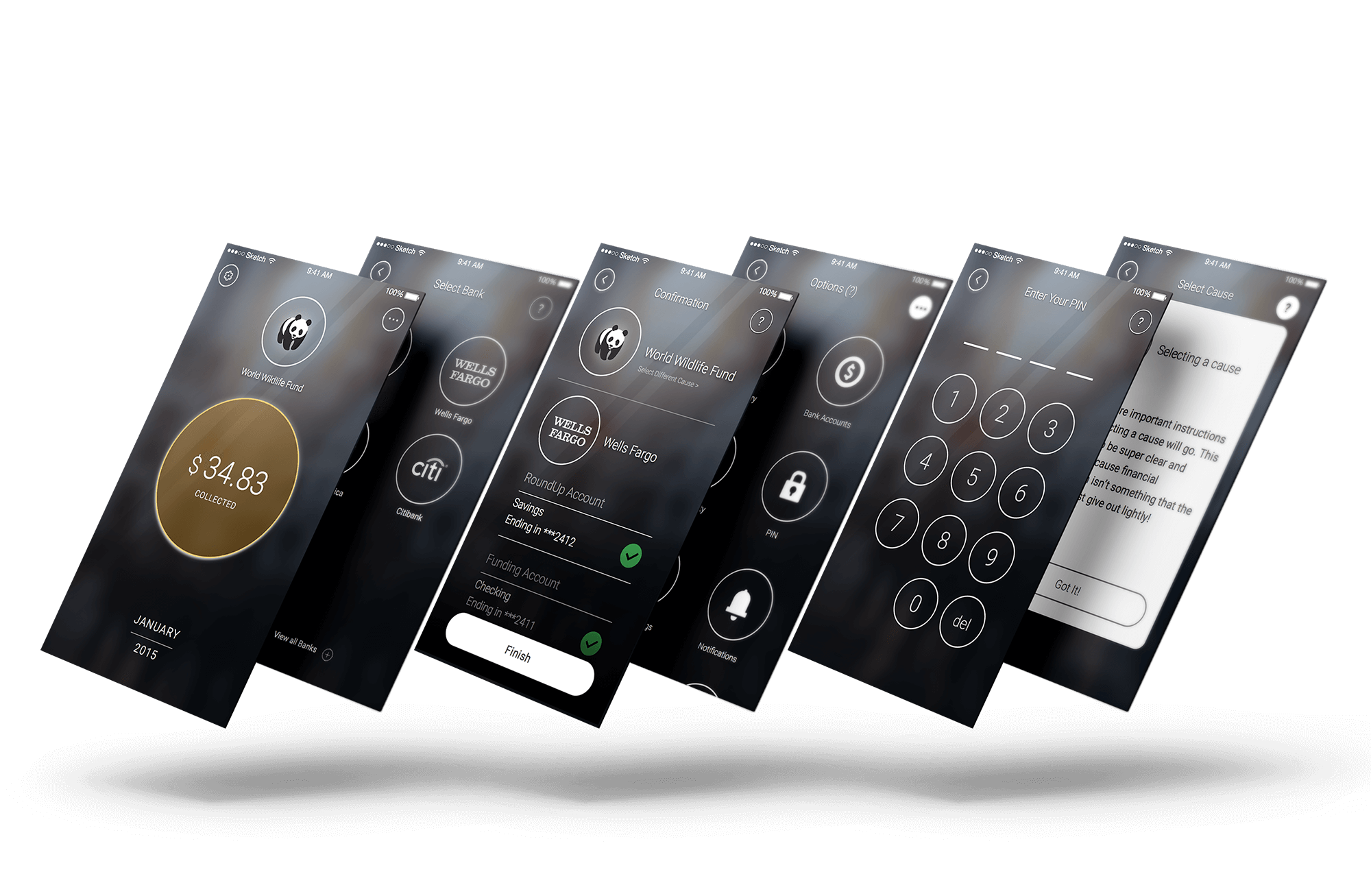
ROUNDING UP SPARE CHANGE OVER TIME TO DONATE TO CHARITIES
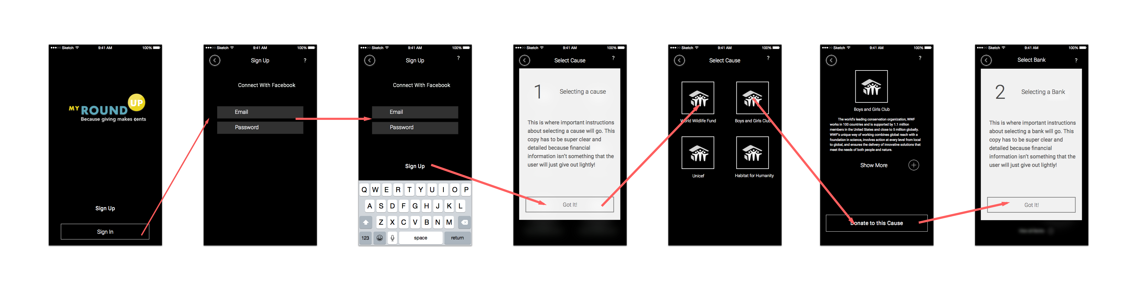
myRoundUp was the first project I worked on at Infuse back in 2015. Our client wanted us to design an app that was similar to Acorns, where users could "round up" their credit card transactions and passively put away money to later be donated to a nonprofit of their choice.
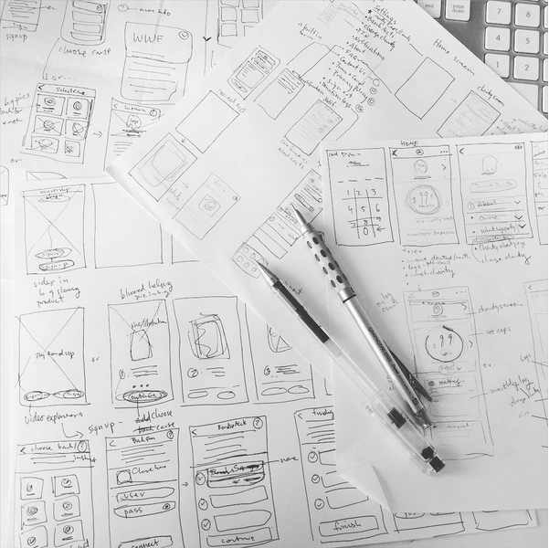
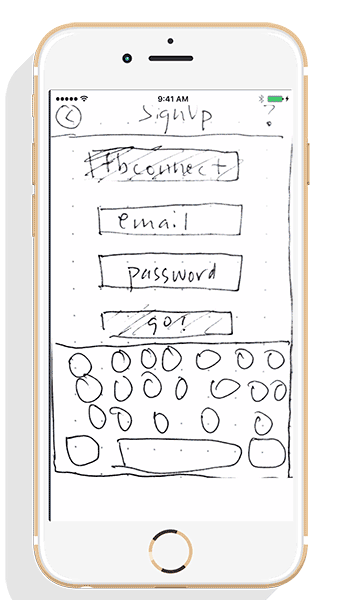
WIREFRAME SKETCHES
REDESIGNING THE UI
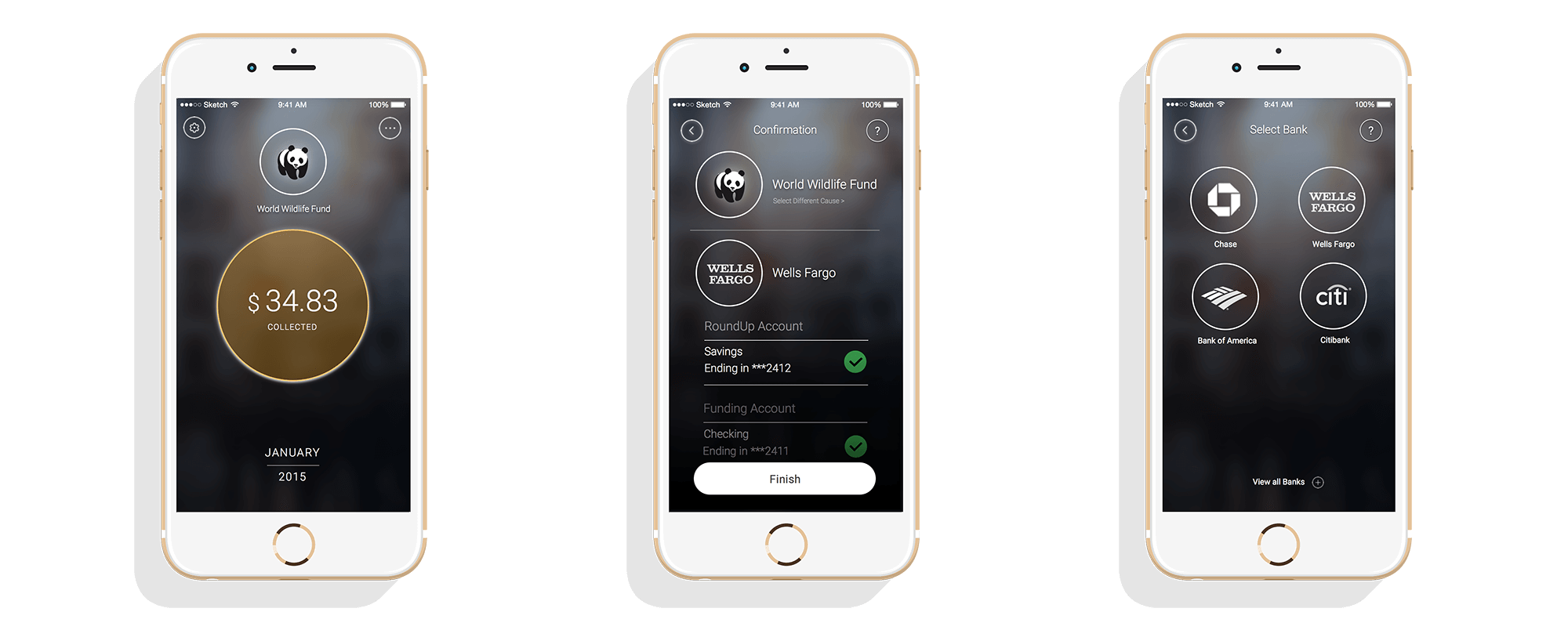
The first iteration of the myRoundUp app was done entirely in Adobe Illustrator, which made changing components extremely time consuming and difficult. When we had the chance to revisit the project, I rebuilt the entire app in Sketch, making sure to rely heavily on symbols and nested components so that changing UI across the app could be quick and simple, as well as consistent.
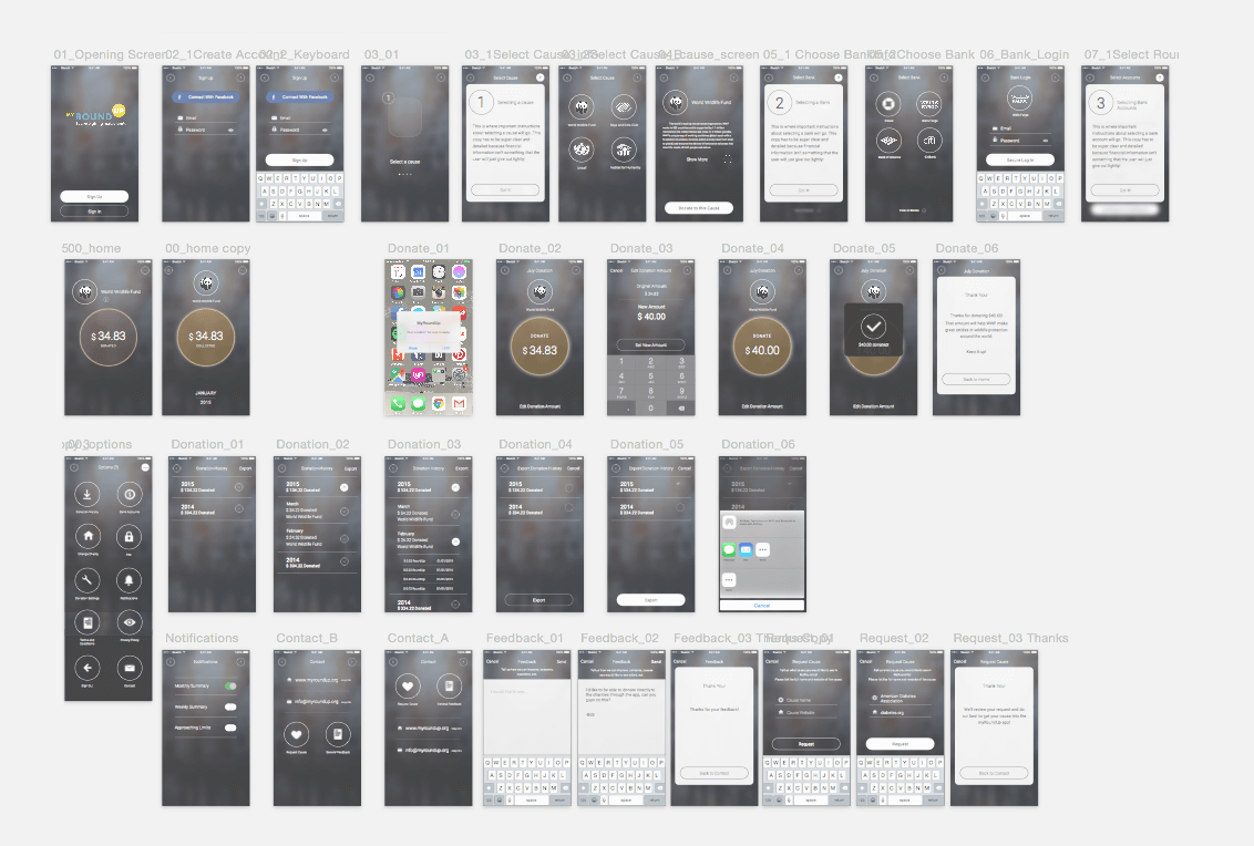
BANK SELECTION SCREEN
Most of the app's functionality was done in the up-front setup- users had to link their financial institutions through the Plaid API, and then would select which funding source they wanted the app to draw money from, as well as which sources to monitor to "round up".
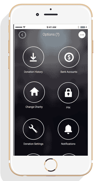
DESIGNING FOR MORE OPTIONS
The first iteration of the app only had a few non-profits on board, and the old design did not easily let users search through nonprofits, nor did it scale for more items. I changed the screen to a searchable list, with options to expand more information about each nonprofit.
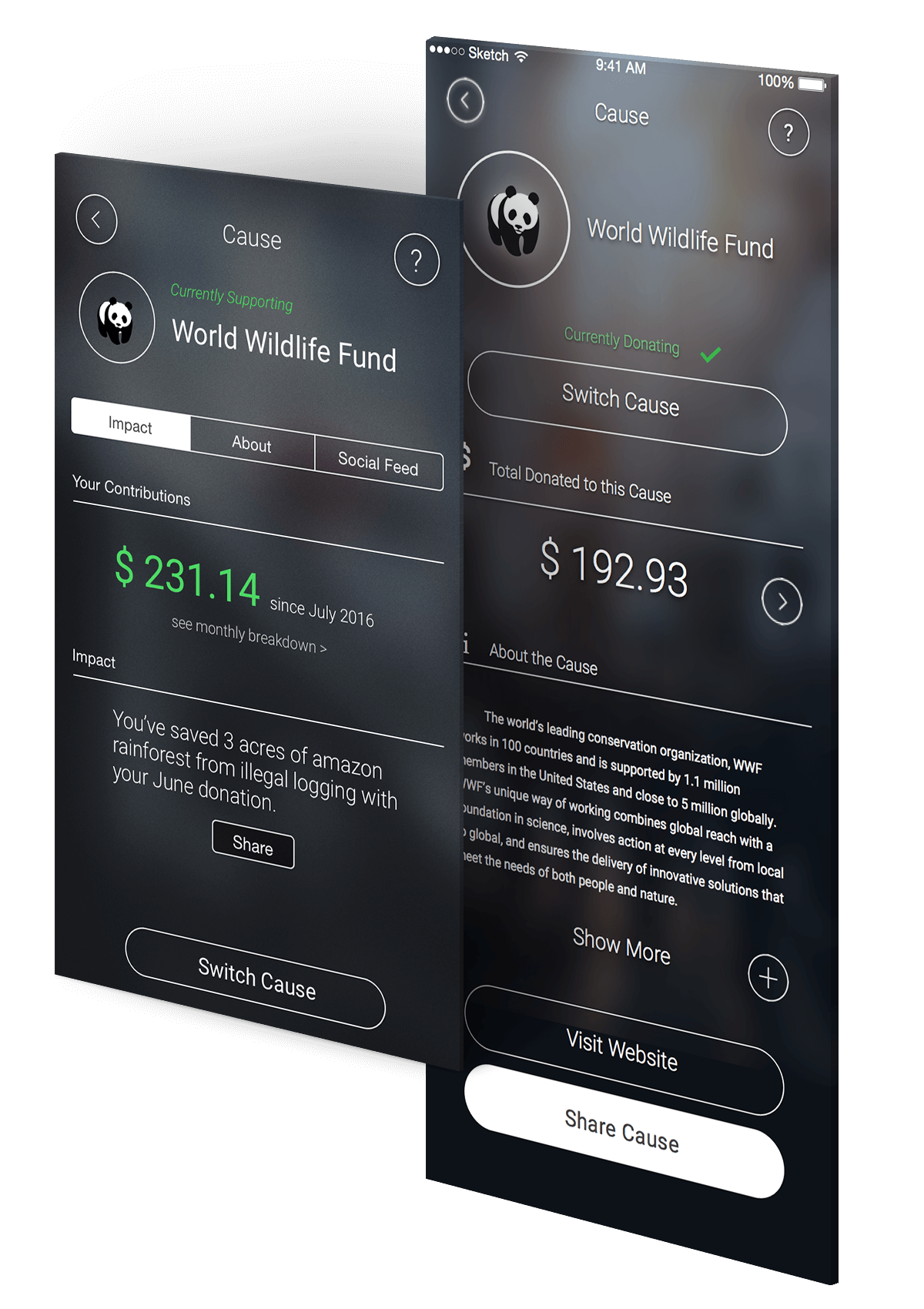
EXPANDED DETAILS ABOUT THE NONPROFITS AND USER IMPACT
When donating to a nonprofit, a lot of people want to know the impact of what their money could do; having a more tangible idea of their impact would hopefully lead people to continue donating. The nonprofit info screens consolidated information like a user's personal impact with a social share function, a summary about the nonprofit, and an embedded social feed from the nonprofit.
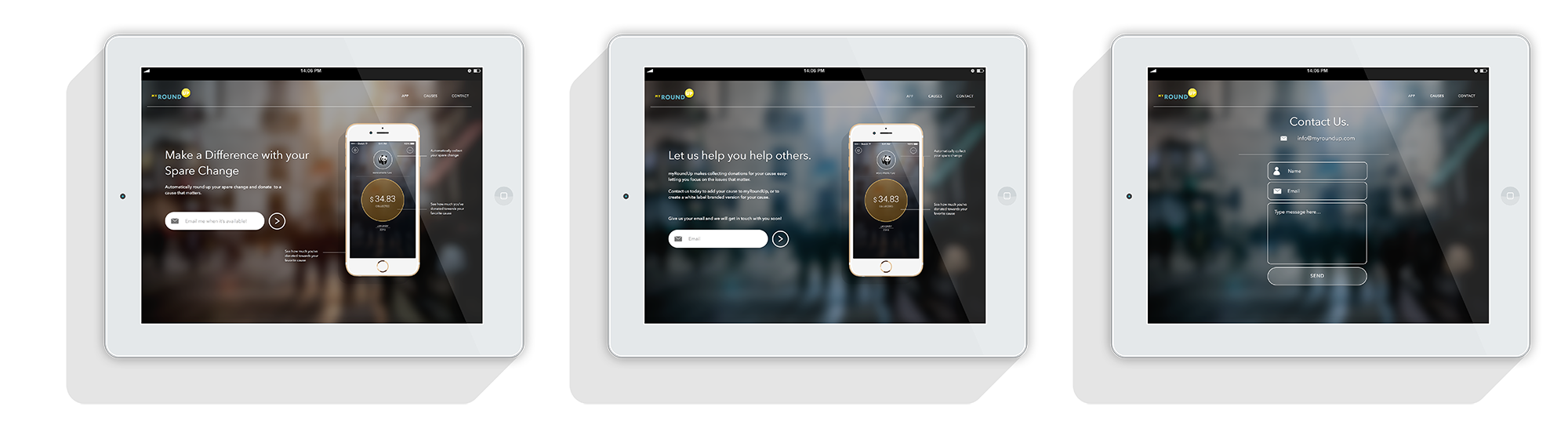
APP LANDING WEBSITE
I designed a simple landing page for the app that explained its functionality, and let people submit their email for app launch updates.
Featured Work
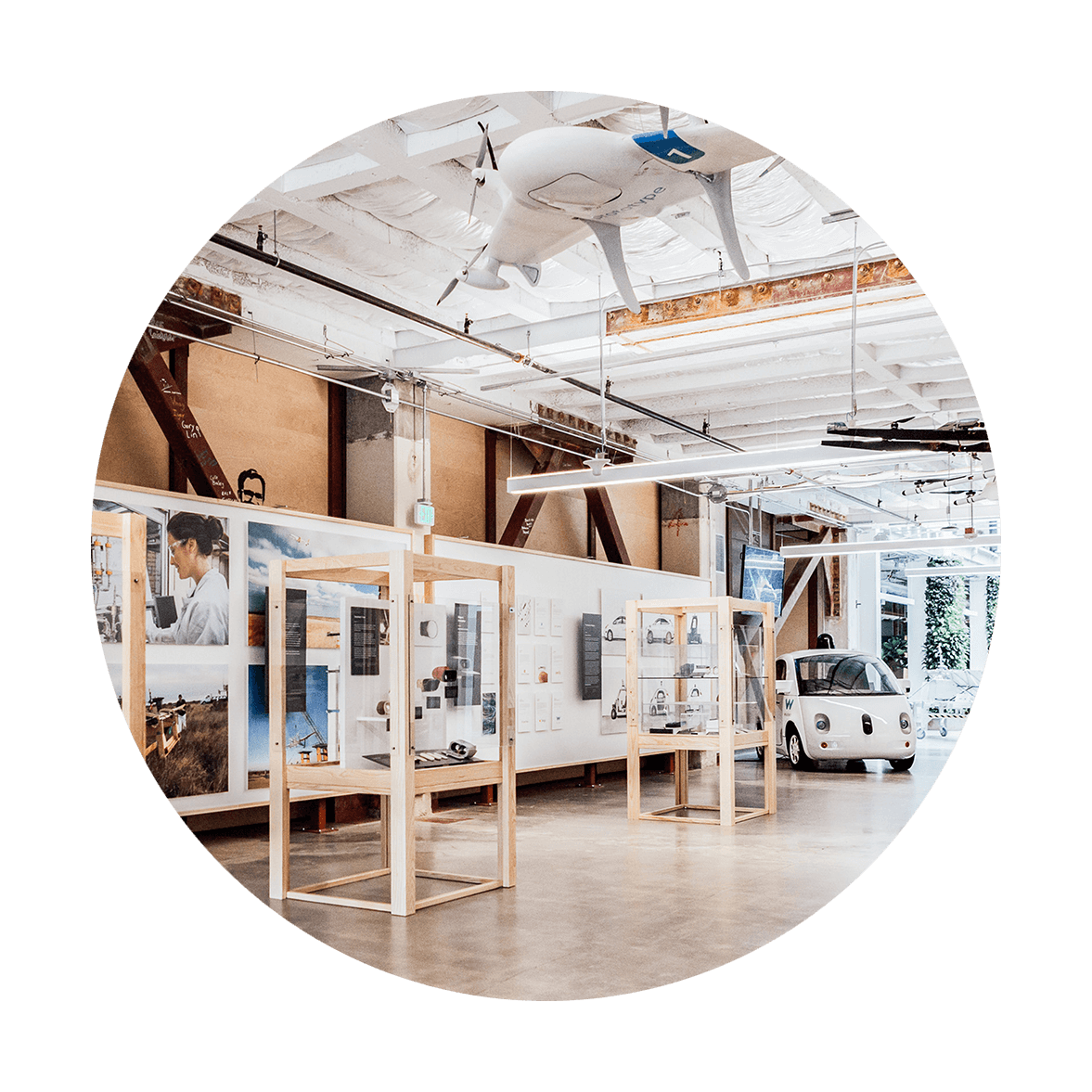
GoogleDesign
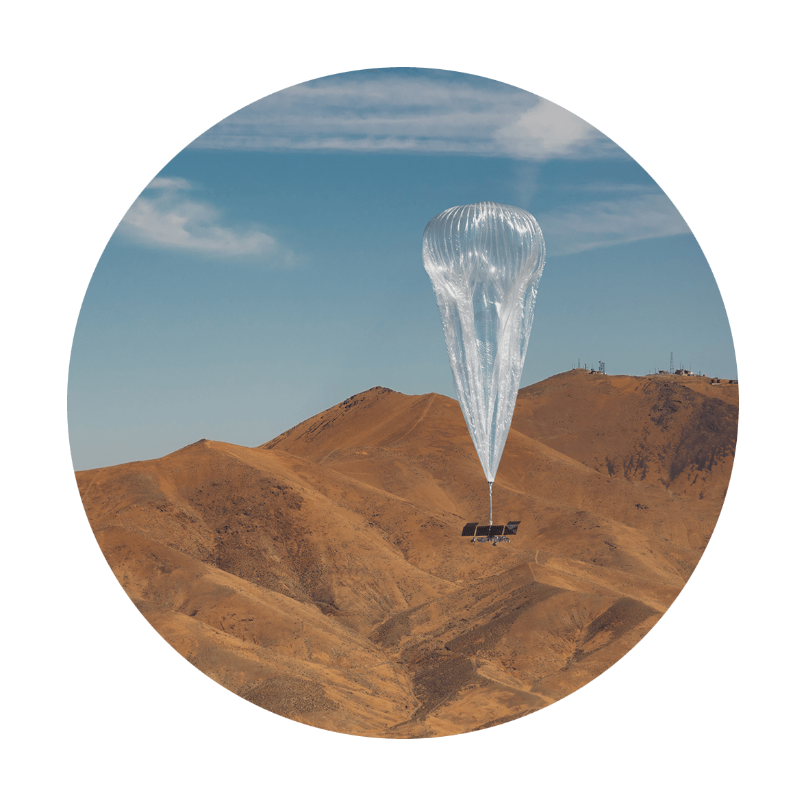
Google Meet HardwareProject type
X WebsiteDesign
X DesignProject type

Music PhotographyPhotography
Contact
Email: juuliawang (at) gmail.com
Linkedin
© Julia Wang 2021